Arctic Data Story
From climate data and Sentinel-2 imagery to an interactive story
Published data story connecting climate data, satellite image analysis, interactive visualizations and historical sources in one accessible experience.
Concept, design, development, data pipeline and copy.
This case shows my ability to build the full path from raw data, satellite-image analysis and backend data flows to a product-like experience people can understand and explore.
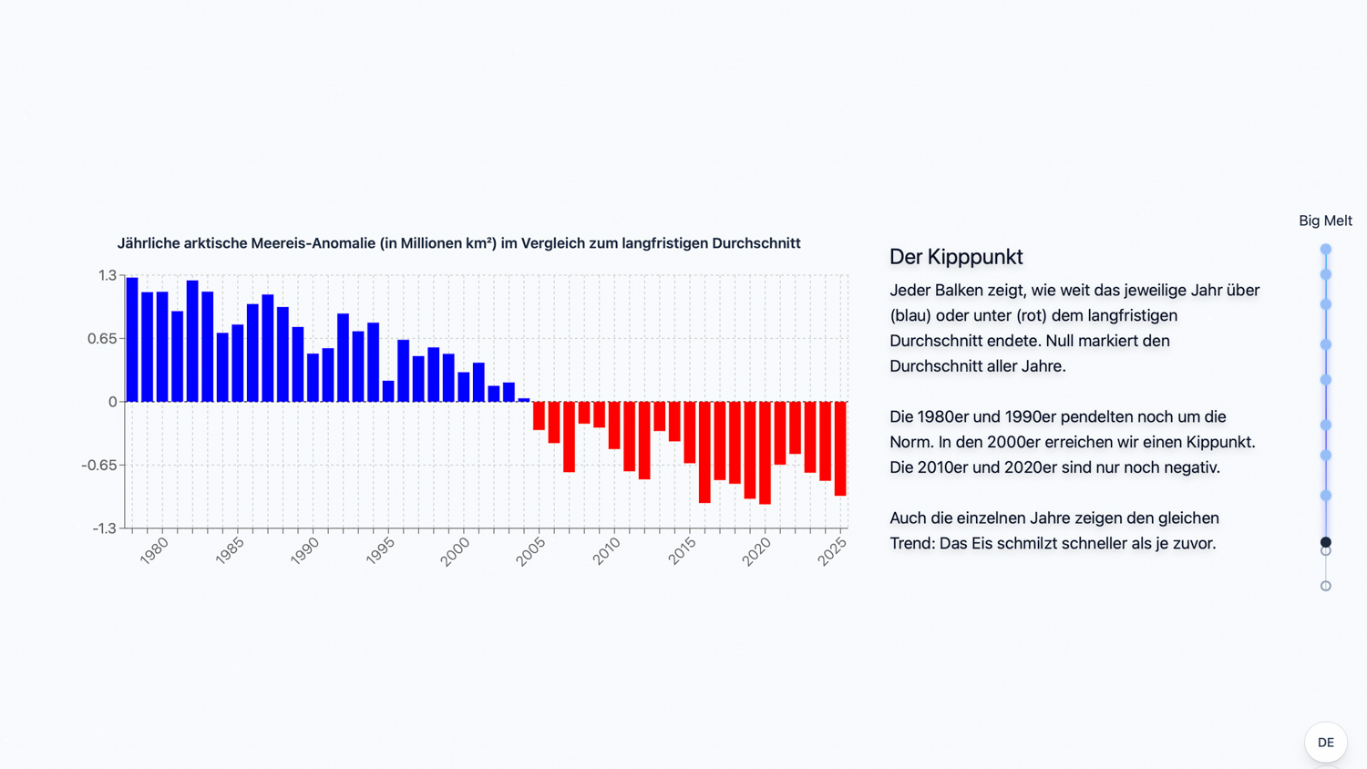
Arctic sea ice is an abstract topic despite rich data availability. NASA, NOAA/NSIDC and OWID datasets, Sentinel-2 imagery and historical perspectives existed separately and needed to become accessible to readers.
The challenge was the mix of data processing, visual explanation and interaction. The story needed a reliable pipeline that turns climate data and image analysis into comparable data points instead of embedding finished charts.
I built a Next.js story with maps, charts and scroll-driven transitions, plus Python pipelines for global climate data and Sentinel-2 fjord analysis, FastAPI endpoints, PostgreSQL/JSON fallbacks and a RAG chatbot for historical Inuit texts.
What this case proves
Data needs product shape
Good visualization starts with the data flow: which raw sources become reliable, comparable and understandable for users?
Balance explanation and exploration
The story leads readers through the topic while leaving enough interaction for them to discover their own comparisons.
Technology serves understanding
Pipelines, APIs, maps and RAG are useful because they make a difficult topic more concrete.
The opening connects place, thesis and visual material so the topic becomes concrete quickly.
A data pipeline with a story interface
The visible story is only the final layer: public climate datasets, Sentinel-2 imagery, a dedicated processing CLI and backend data flows feed the same maps, charts and scroll scenes.
Normalize climate data
NASA GISTEMP · NOAA/NSIDC · OWIDTime series are ingested, smoothed, aligned to calendars and anomalies, then modeled as comparable datasets.
Story, API & dataClassify Sentinel-2 imagery
STAC · UNet · NDSI/NDWIThe Uummannaq pipeline loads tiles, masks clouds, separates ice, water and land, and exports overlays plus CSV metrics.
Satellite pipelineServe aggregates
FastAPI · PostgreSQL · JSON fallbackGlobal climate data and fjord aggregates are delivered through backend endpoints and fallback files for resilient story loading.
Story, API & dataMake it understandable
Next.js · Maps · Charts · RAGScroll scenes, maps, charts and chat connect the technical data flows to a readable experience for non-expert readers.
Public datasets became product-ready
- Ingested and normalized NASA GISTEMP, NOAA/NSIDC Sea Ice Index and OWID CO2 data
- Prepared calendars, outliers, smoothing, anomalies, IQR stats and correlations for the UI
- Modeled data so maps, charts and scroll scenes use the same reliable foundation
Satellite imagery became fjord data
- Translated Sentinel-2 analysis into ice, water, cloud and land fractions
- Derived Uummannaq fjord aggregates such as season bands, spring anomalies and mean ice fractions
- Made freeze and breakup dates usable in the story from classified time series
Data flowed into the scroll scenes
- Served global climate data and Uummannaq fjord data through FastAPI routes
- Used PostgreSQL as the primary store and added JSON fallbacks for resilient delivery
- Fed Next.js scenes, maps and charts directly from those data flows
A data-heavy topic became usable
- Complex climate data and image analysis became visual and interactive
- The project demonstrates end-to-end work from data pipeline to interface
- The execution combines journalistic clarity with product-minded technical delivery