Map the Air
Hyperlocal air quality as map, time series and comparison
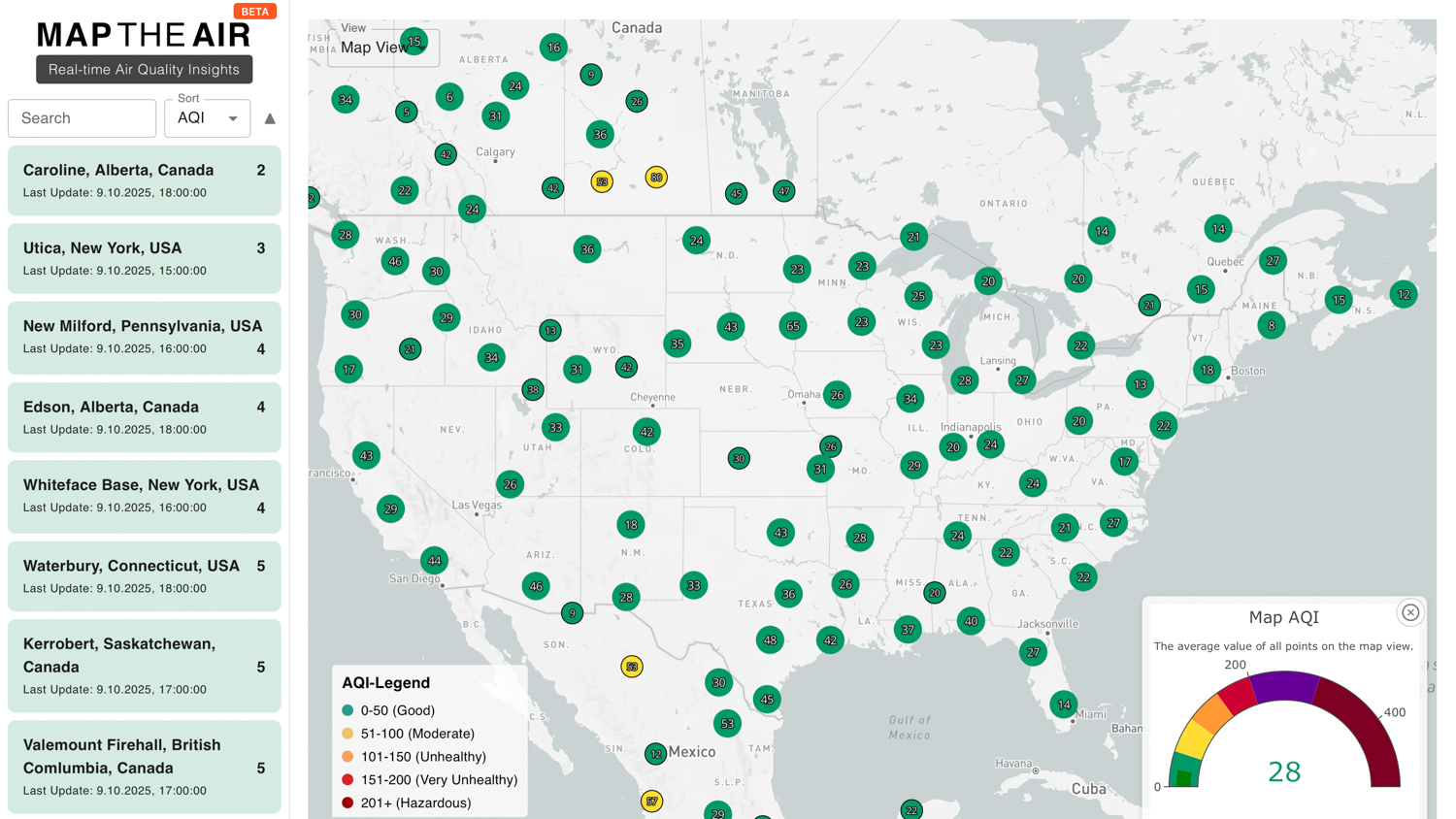
9,000+ sensors unified in one interface with normalized readings, map views and time series for local comparison.
Concept and development.
This case shows how I turn scattered data sources into a usable product: not just a dataset, but an interface for comparison and orientation.
Air quality is local, changeable and often hard to judge. Many sensors provide data, but formats, quality and comparability differ.
Users need an interface that explains local readings without exposing them to raw data, sensor formats or API differences.
I aggregated readings from more than 9,000 sensors, normalized them and made them accessible through a Mapbox map with time series and sensor metadata.
What this case proves
Data products need normalization
The value is not more data by itself, but consistent formats, comparability and understandable presentation.
Maps should support decisions
A map helps when users can recognize patterns, outliers and local development without extra context.
Open data still needs good UX
Community and sensor data become useful when quality, freshness and context are visible.
The entry makes clear that this is about local measurements, not abstract environmental statistics.